Product Designer
Brigham & Women's Hospital
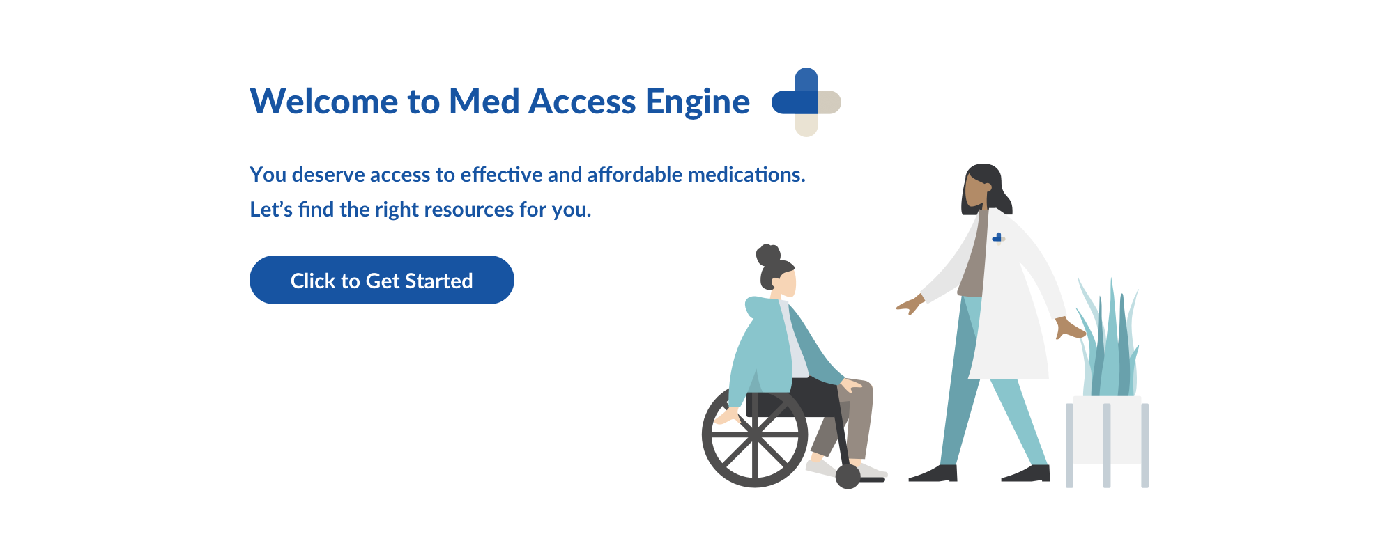
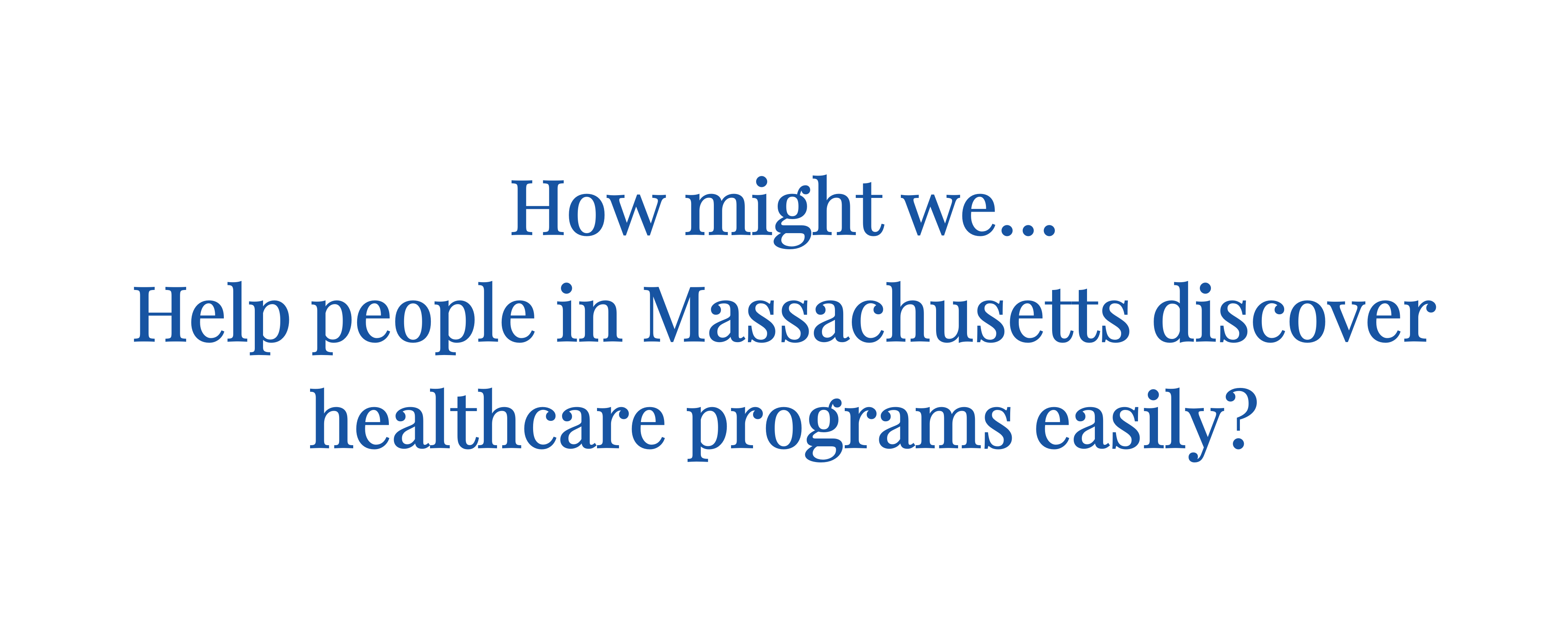
During the Spring of 2019, I decided to take on a freelance design project that could make a positive impact. A pharmacist at the Brigham & Women's Hospital approached me to help with a responsive website. The idea was to create a resource that could help patients find what programs they can qualify for in Massachusetts.
Team members for this project included myself and Channel De Leon (Pharmacist + Project Manager).
Patients often do not know how they can lower their health insurance costs, specifically related to prescriptions. When they visit their doctor’s office, they are given several paper pamphlets on programs they might qualify, often this literature is actually out of date or the patient doesn’t qualify. The most updated information is usually on the program’s website.
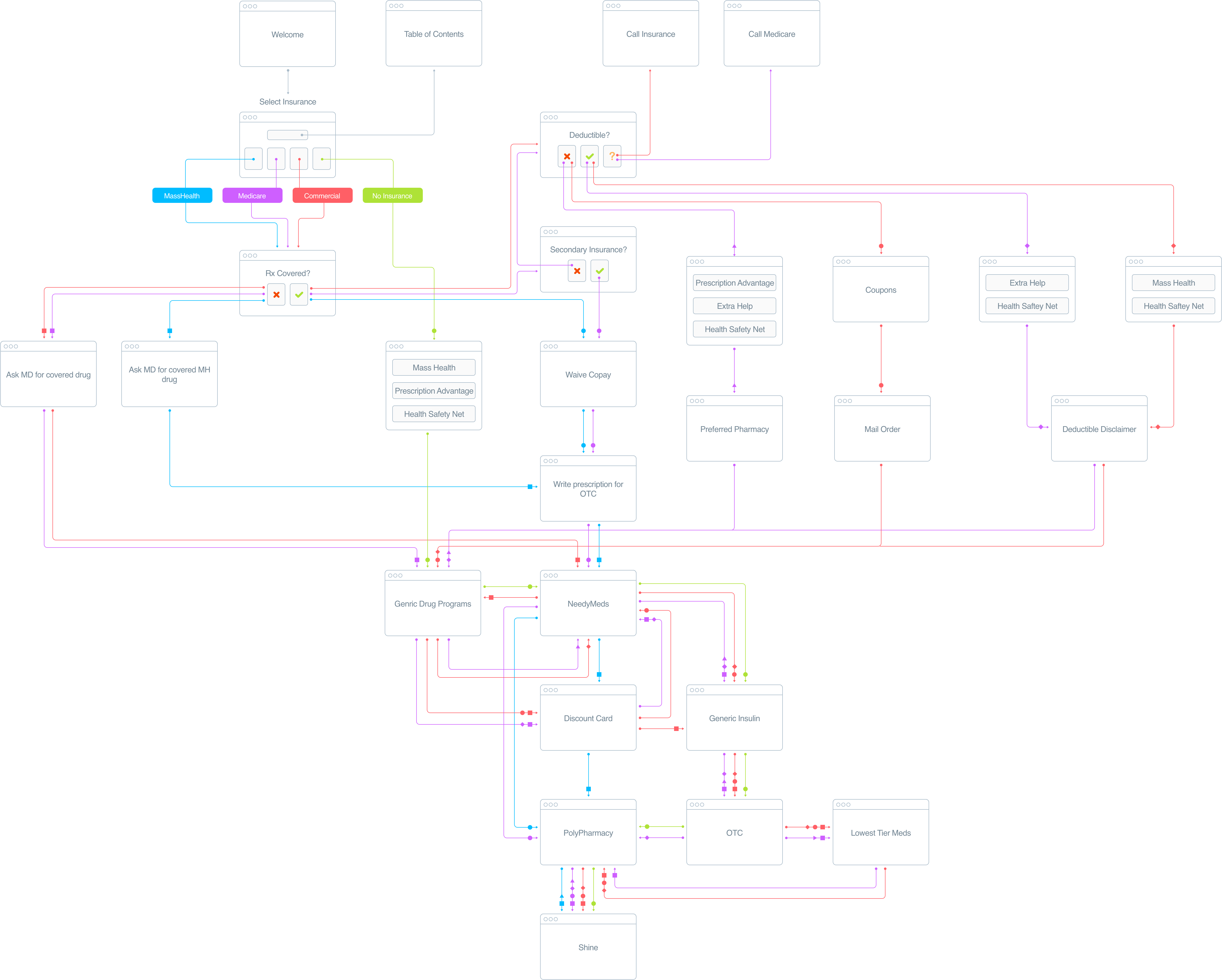
When I joined the development of Med Access Engine, a user flow diagram had already been created by the pharmacist, Channel. She developed an algorithm for the website that would help predict the next most useful programs based on what type of insurance, income and other factors. As a pharmacist, she was very familiar with the types of programs offered, as well as which would be the most relevant for the patient.
I created this user flow diagram to show the different paths a user could take through the website. It would also be a reference for the engineer to build out the website.
As a part of this project, Channel and I wanted to make sure the experience we created would make sense to the patients who would be accessing it. I created an interactive high fidelity prototype using Marvel that was loaded onto an iPad.
Channel was able to recruit some of her patients at the Brigham's Women's Hospital for user testing. She conducted several rounds of moderated user testing. After each round Channel documented any notable feedback. This was then implemented into the designs and re-tested with the patients.
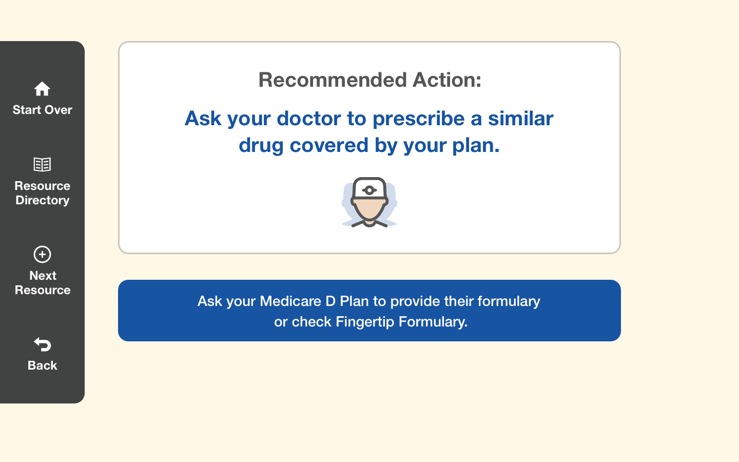
In the first version of the prototype we tested, there was two navigation links in the top of the screen that would allow the user to start over or get more help. Channel noticed patients wanted to try different options to see different outcomes, these patients had to start from the very beginning. Instead of using the back button in the browser we added an additional menu link to allows users to quickly go back to the previous step within the navigation menu.
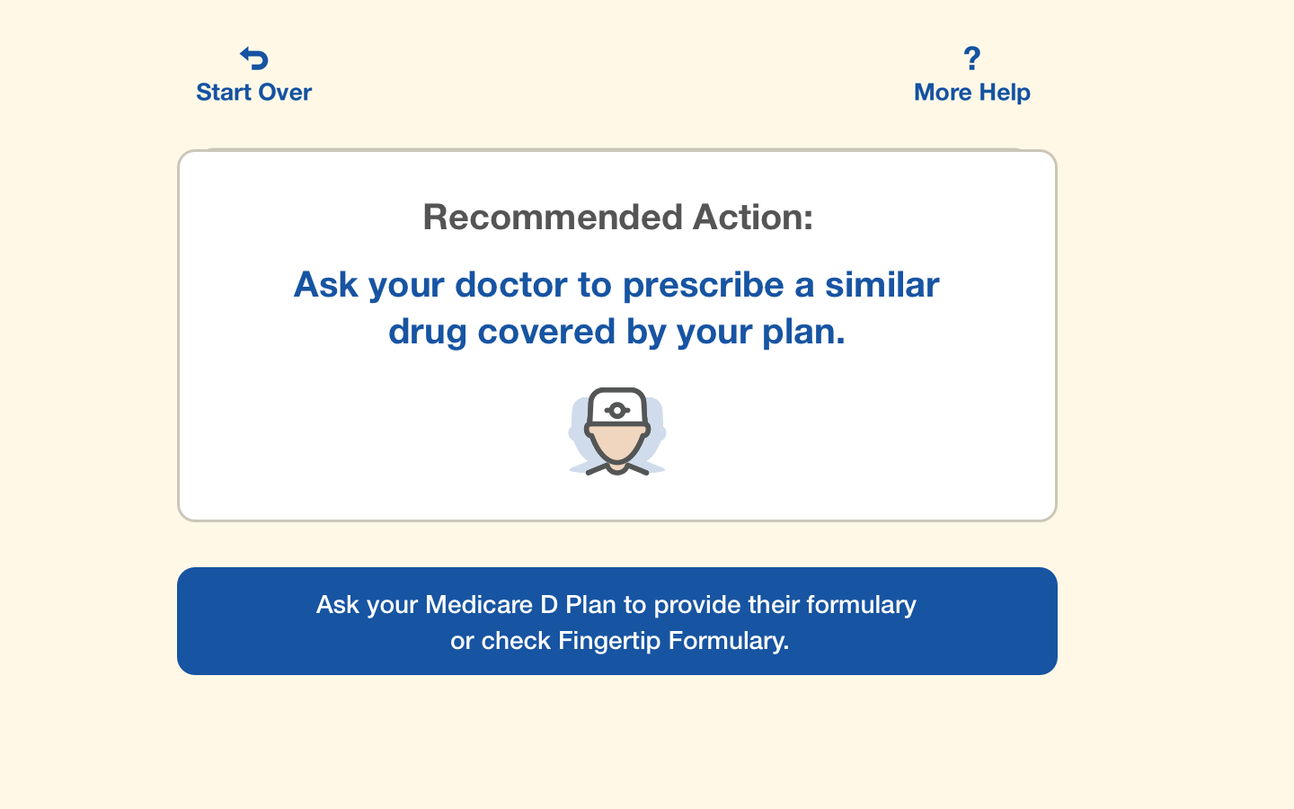
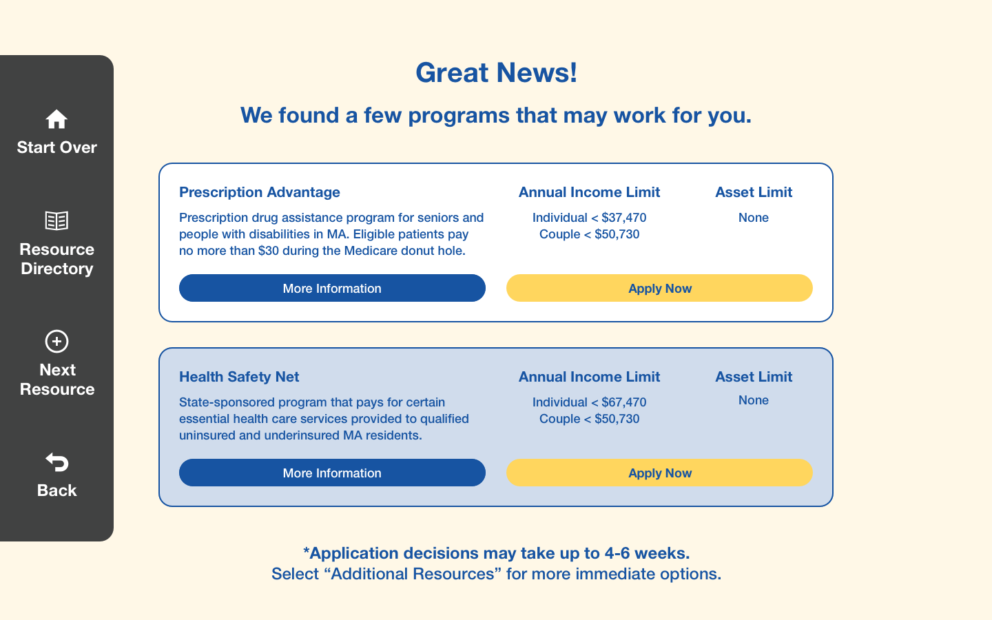
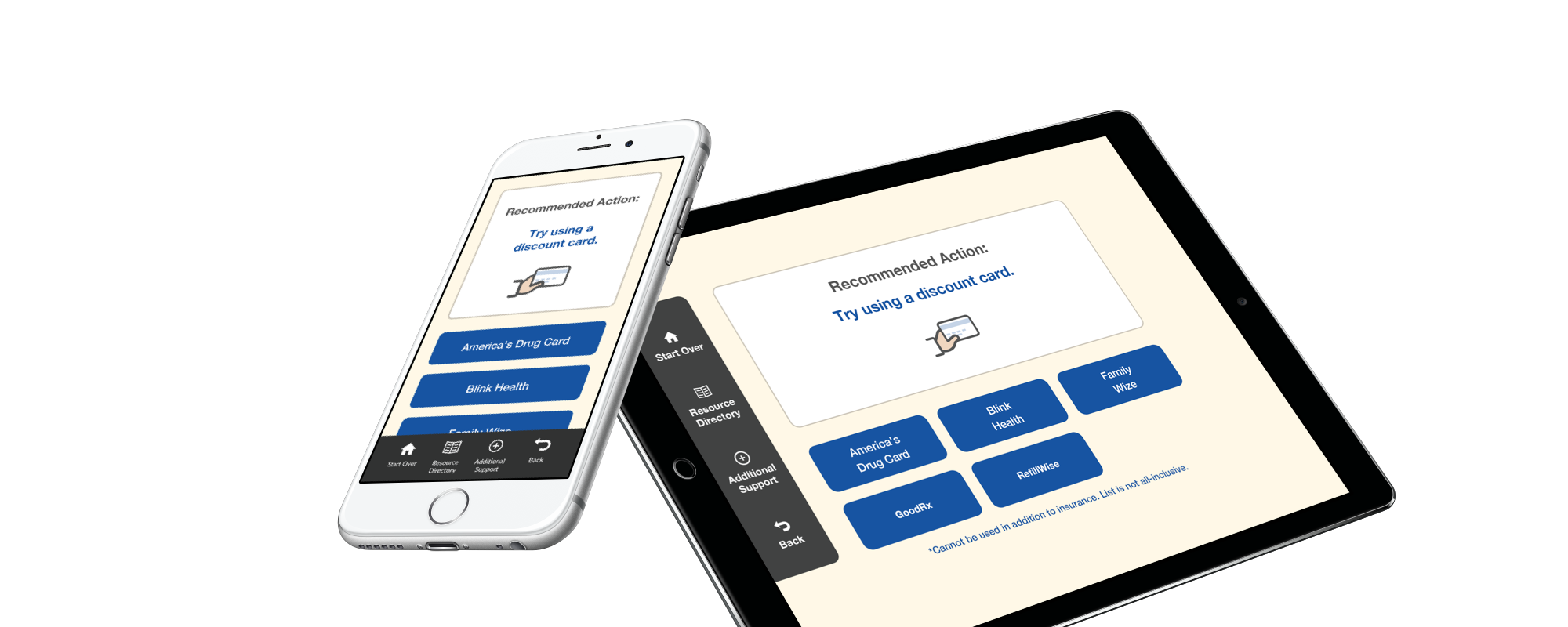
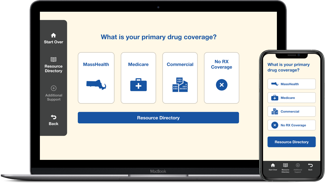
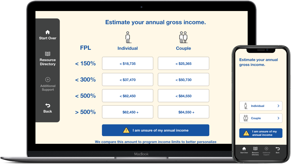
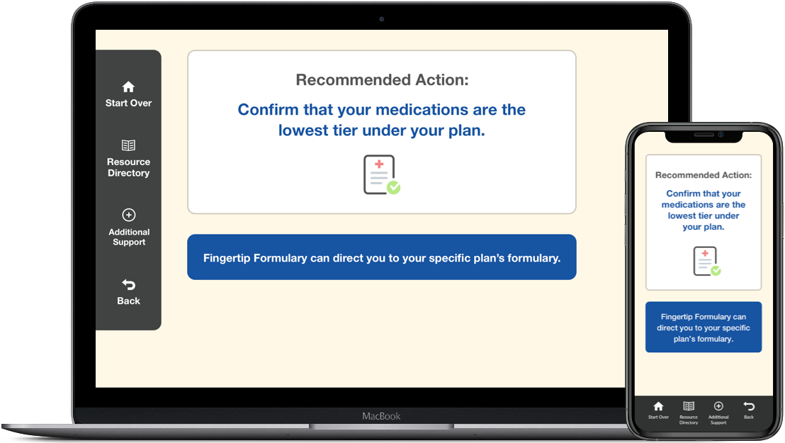
Patients enter the experience by answering a series of questions about their insurance deductibles, income, and other factors. The answers to these questions determine which programs would be recommended. Since patients flowed through the experience pretty quickly when they reached the recommended program screen, they felt as if it was too easy. Channel noticed users kept clicking the 'more help' link. This link was intended to provide additional programs if the patient had already exhausted the recommended program.
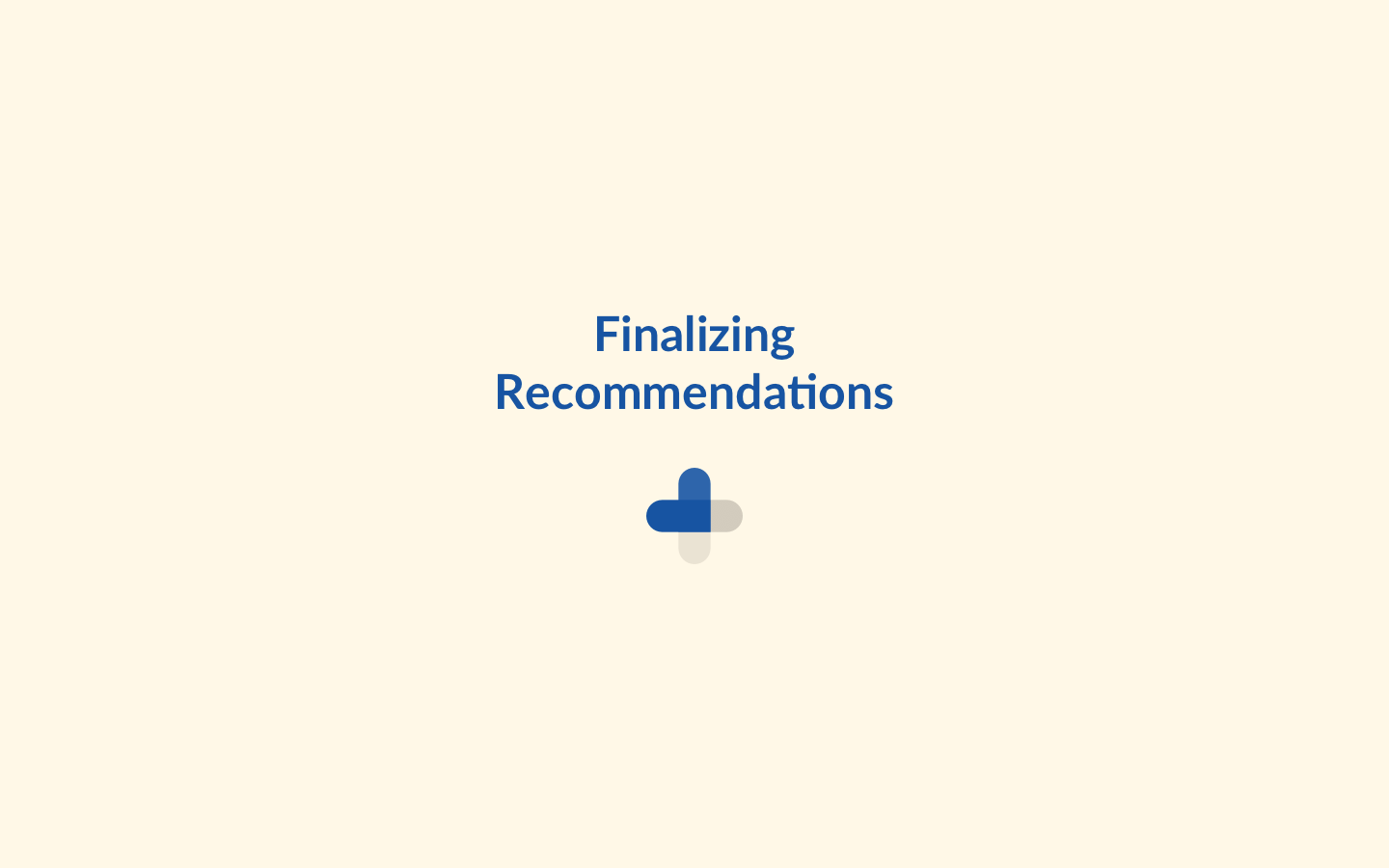
We realized there needed to be some sort of waiting period between answering the questions and getting the recommended program. Even though we would know immediately what program to recommend, building in a few seconds between the screens would allow the patient to understand that their recommended result is loading.
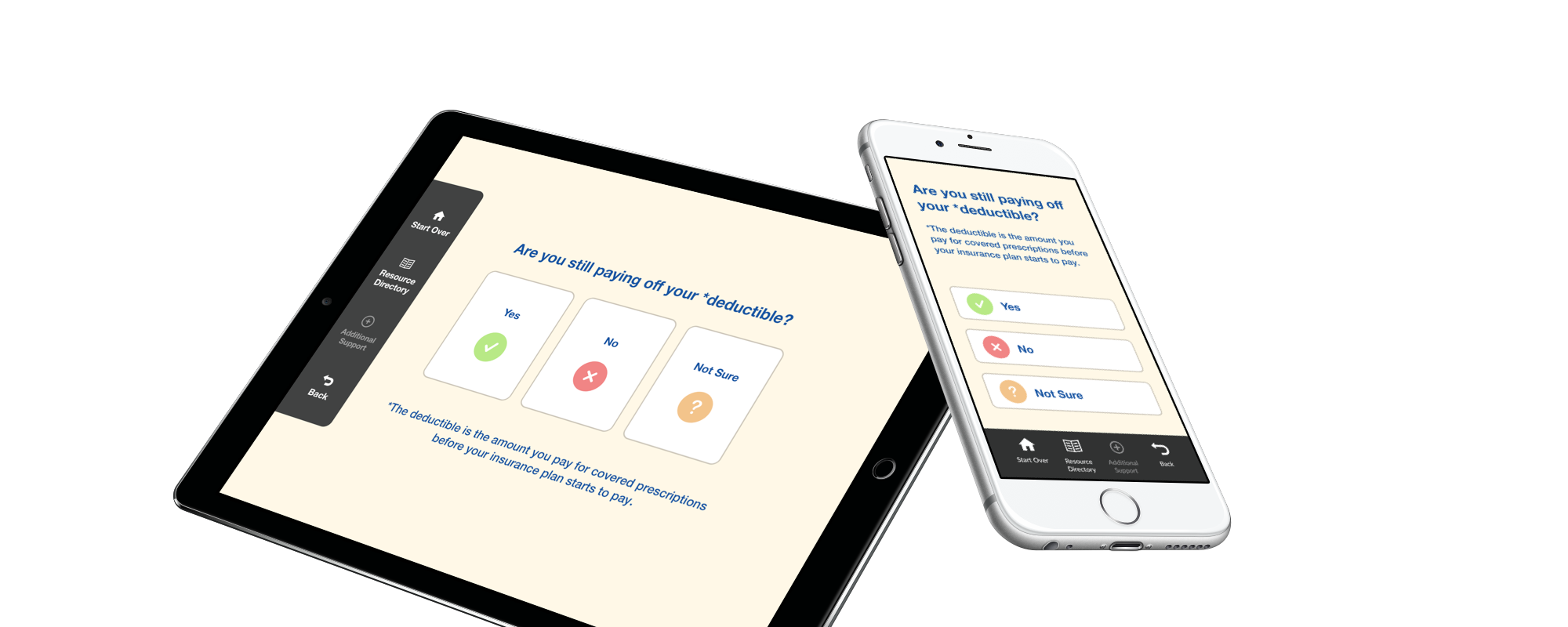
The language used around medical insurance can be technical and often times hard to understand. Through user testing, we were able to dial in some areas where patients were having trouble getting through the experience.
Some Examples:
Before: Are the medications you take on the insurance formulary?
After: Are any of your prescriptions not covered by your insurance plan?
Before: Are you in the deductible?
After: Are you still paying off your deductible?
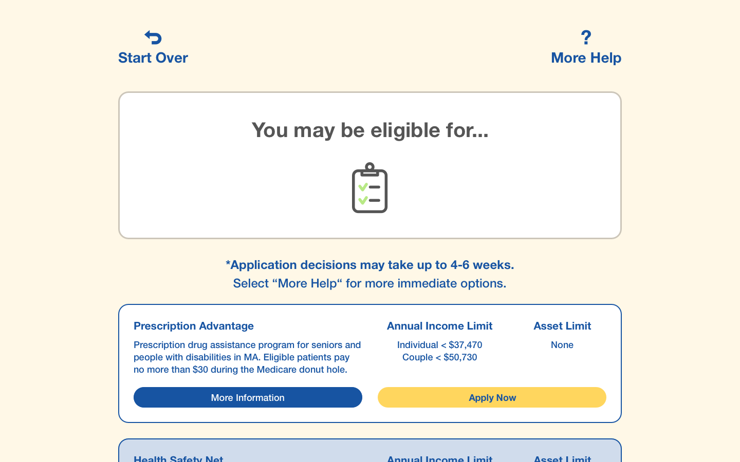
Before: You may be eligible for...
After: Great News! We found a few programs that may work for you...
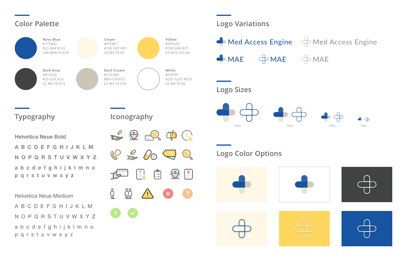
As a part of this project, I created a brand style guide that included variations of logos, a color palette, and typography styles. This guide would provide an overview of the visual direction of the product and help to keep consistency with developers and designers.
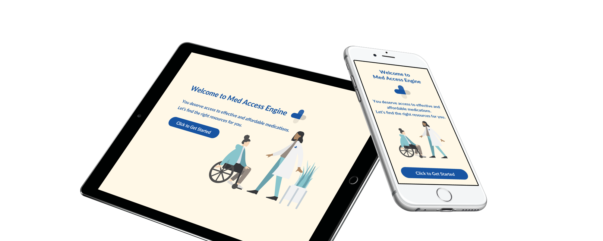
Up to this point in the project, Channel and I had focused mostly on the web experience. We wanted to have a full responsive website for those patients who may be using this resource on mobile.
For any other questions about this project or anything else, please contact me at hello@joannajliu.com.